
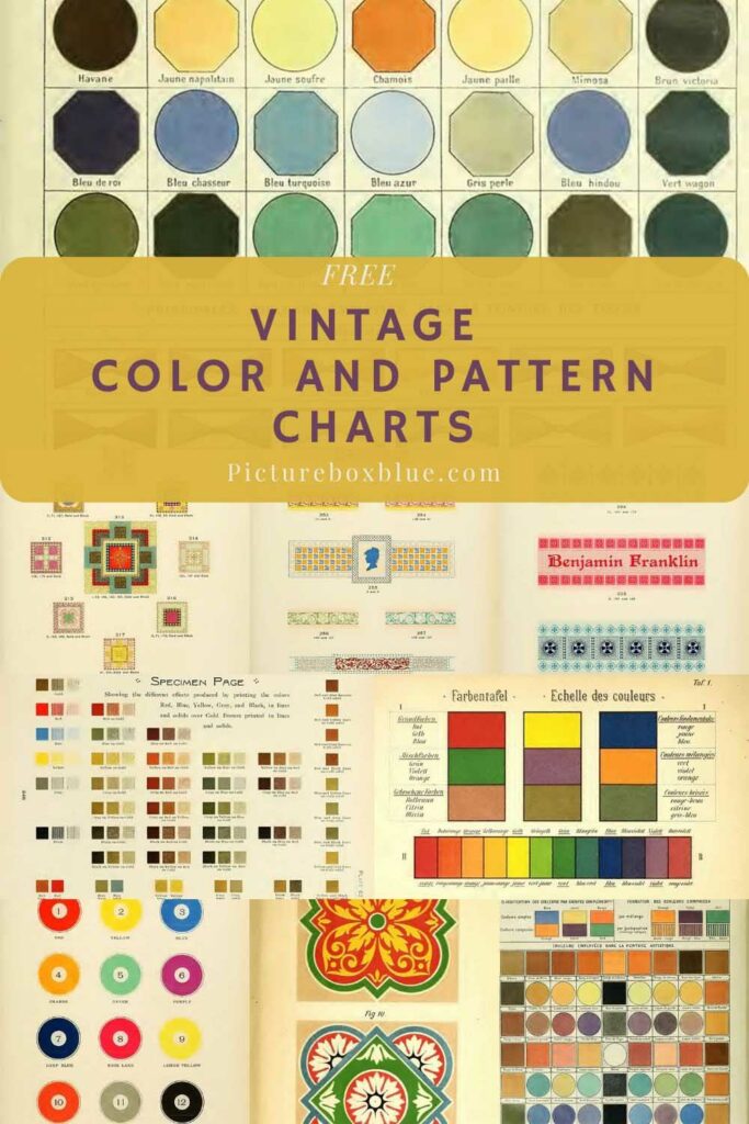
Recently, I came across several old art and design books, many of which have beautiful plates of vintage colour and pattern charts. The collection complements the vintage colour wheels and vintage art supply posters featured on the site.
Most books were texts for art students explaining the details of colour theory. Many of the book’s colour and pattern illustrations were used to illustrate different aspects of the theory.
To print the colour chart or pattern you want, click on the title above it. A higher-resolution image will open in a new window. If you right-click on that image, you will have the menu option to save it to your hard drive.

Suggestions for the Study of Colour
The following colour and pattern charts come from the book “Suggestions for the Study of Colour” by Carpenter, H. Barrett (1923). Henry Barret was the headmaster of the Rochdale School of Art in the UK then.
Henry writes in the preface of this book “A master of Colour, like a master of words, is born, not made, yet who would argue that a child should not be taught to speak? Even so, it seems absurd not to teach a student the ABC of Colour, if we can but find what we should teach.”
“Simple harmony is the effect produced by using any colour together with its next neighbour, or neighbours, in their natural order.”
This color pattern chart depicts the following all in their natural order of tone, as an illustration of Harmony:
- Three colours—yellow, orange and red
- Three colours—yellow-green, green and blue-green
- Three colours—rose, purple and violet.
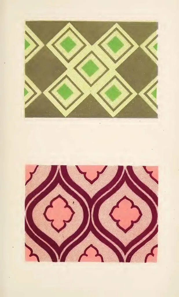
- An example to illustrate “ Extended Harmony/’ Two separate schemes are included in this pattern. The stronger scheme consists of yellow-green, green, and greenish-blue; the paler scheme consists of yellow, orange, rose, and green-blue.

In the book, Carpenter suggests that their three pairs of true contrasts and look best when one of the two colours greatly exceeds the other in quantity.
- Orange-yellow and blue.
- Red and green-blue.
- Yellow-green and violet.

“The natural order of colours seems often to be reversed, but only when the colours appear in small quantities. It is this reversal of the natural order to which the name “ discord ” is here given”.

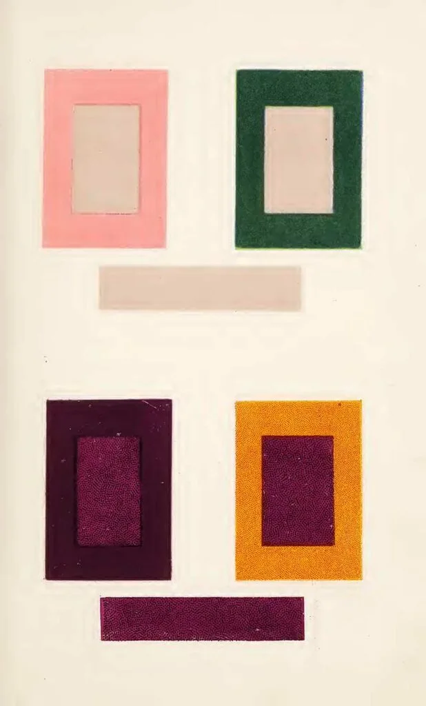
“Effects produced by using keynotes of bright colour with comparatively dull surroundings. The areas occupied by bright green and bright rose are small compared with the whole field on which they stand, but the effect produced is of a bright green, and of a bright pink, pattern.”

5. Intermingled Colour Patterns
“A neutral grey surrounded by rose appears quite different from the same grey surrounded by dark green.
A corresponding change takes place in the purple in accordance with its surroundings, blue making it look more red (with an inclination to orange), and orange making it look more blue.“

The Colour Printer
The following colour and pattern charts are from “The colour printer. A treatise on the use of colours in typographic printing” (1892) by Earhart, John F.
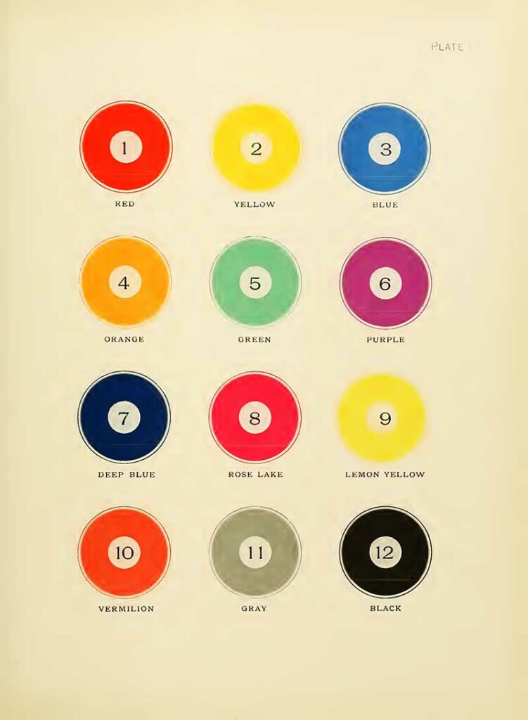
On this colour chart, there are 12 number colours. “One of the main objects in making this selection of colours was to have them as far removed from one another as possible so that we could get a greater variety of mixed colours“.
The first three colours are the primaries—red, yellow, and blue. Then, follow the three secondary colours—orange, green, and purple. Then follow deep blue, rose lake, lemon yellow, vermilion, grey, and black.
“Purple was selected instead of violet as one of the secondary colours because it lies about halfway between the red and blue, while the violet is a little too near the blue.”

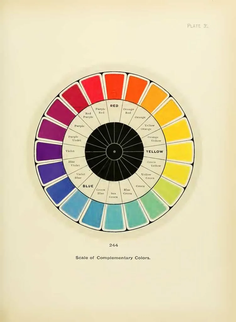
“This plate represents the colours of the solar spectrum, arranged in a circle so as to bring colours which are complementary and directly opposite to each other. In combining colors there is a wide difference of opinion as to what is correct and what is not. Of course, when harmony is produced, that is certainly correct. But the question with printers the world over is: what rule can be safely followed to obtain harmonious results in the combination of colours.“
The Harmony Rules in the book to accompany the chart.
- The Harmony of Scale — by Contrast of Tone.
- The Harmony of Scale — by Gradation of Tone.
- The Harmony of Relative Colors — by Contrast of Tone.
- The Harmony of Relative Colors — by Gradation.
- The Harmony of a Dominant Color.
Second Series — Harmonies of Unrelated or Contrary Colors, which includes : - The Harmony of Distant Colors — Equal in Tone.
- The Harmony of Distant Colors — by Contrast of Tone.
- The Harmony of Colors with black.

The Harmony of Distant Colors — Equal in Tone, is produced by the combination of two colors which are complementary, or nearly so — each being about equal in depth of tone.
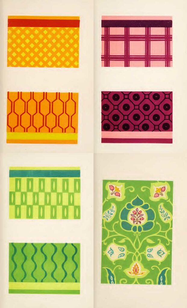
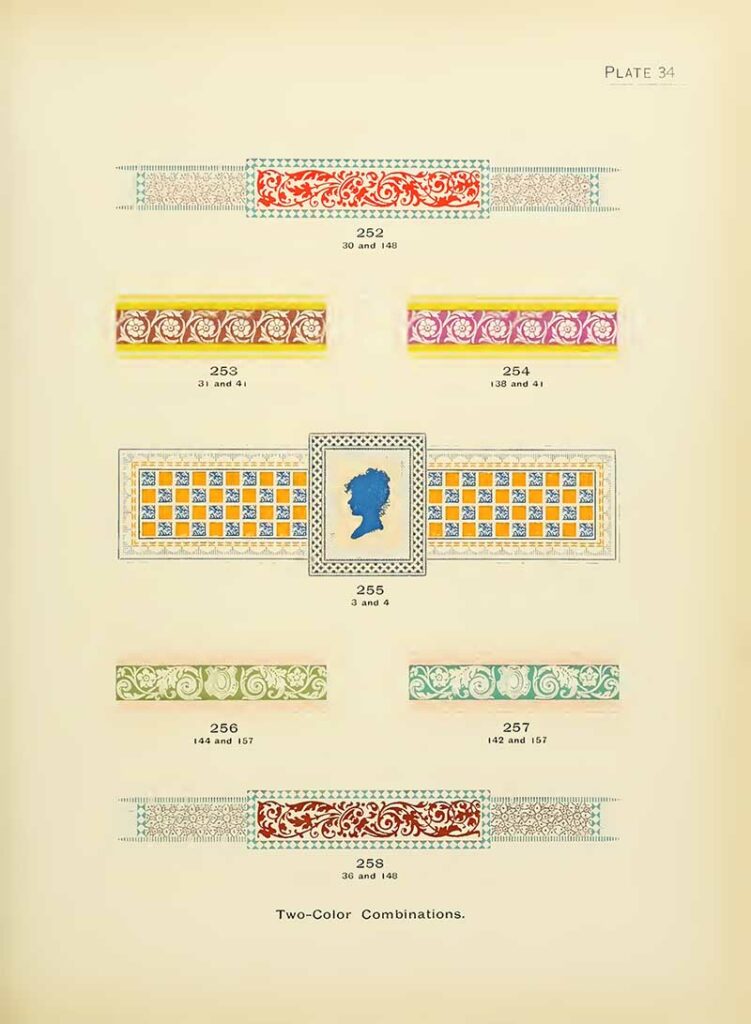
9. Two Colour Pattern Combinations 2
“Blue makes the most effective combination with any one of the colors lying between red and yellow.
Its best combination is orange. Orange will harmonize with any one of the colors lying between green and violet, in their normal state, or when reduced with white, or when slightly modified with gray. Orange makes the best
combination with any one of the colors lying between sea-green and blue-violet. For example see Fig. 255, Plate 34.“
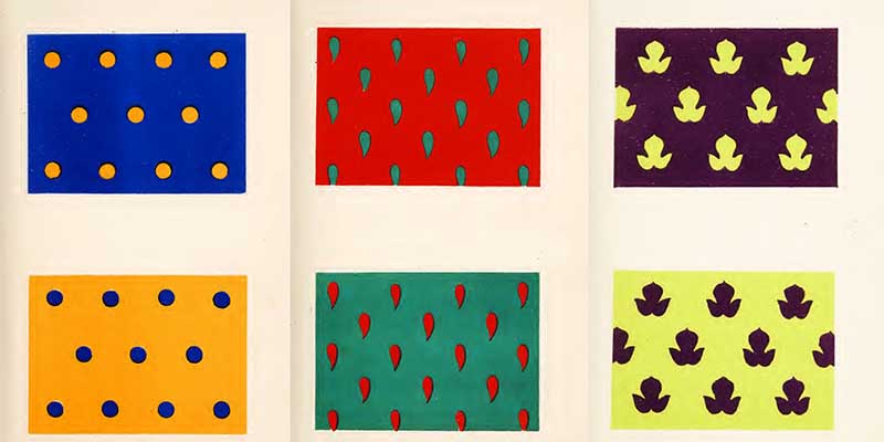
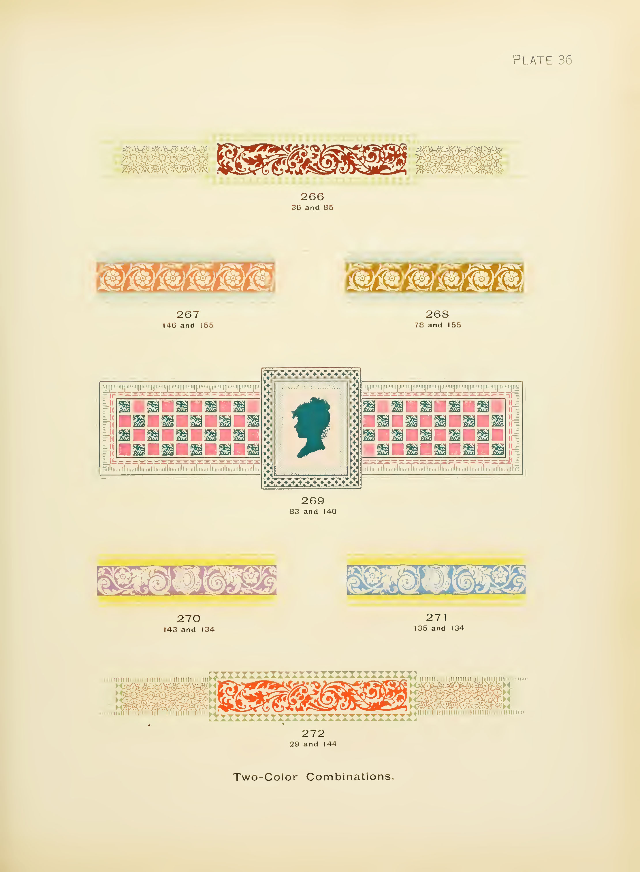
10. Two Color Pattern Combinations 3
11. Two Color Pattern Combinations 4
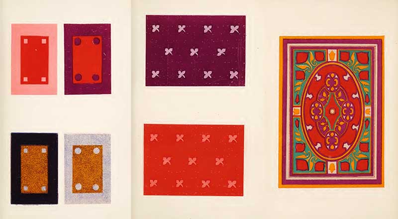
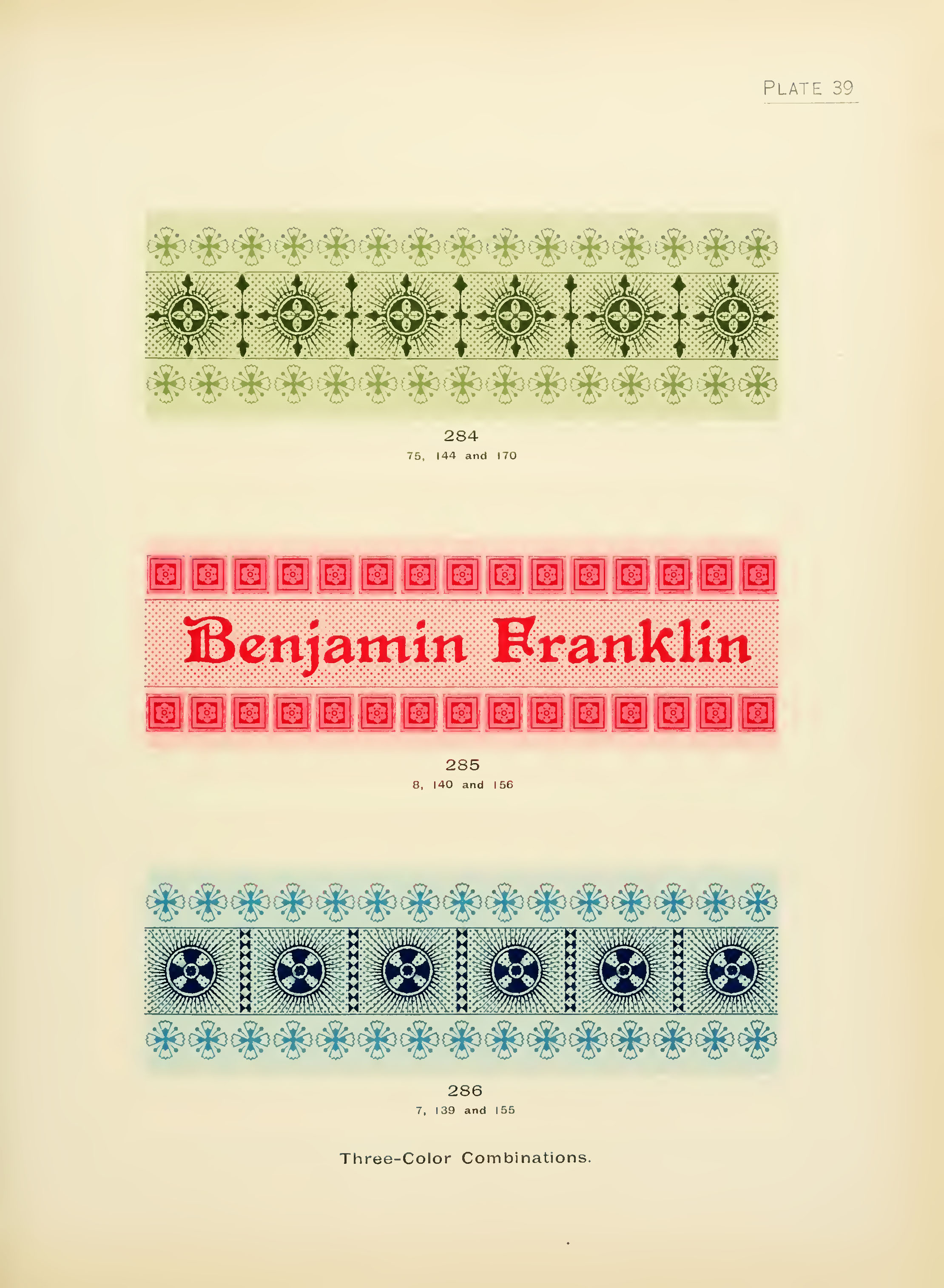
12. Three Color Combinations 1
14. Three Color Combinations 3
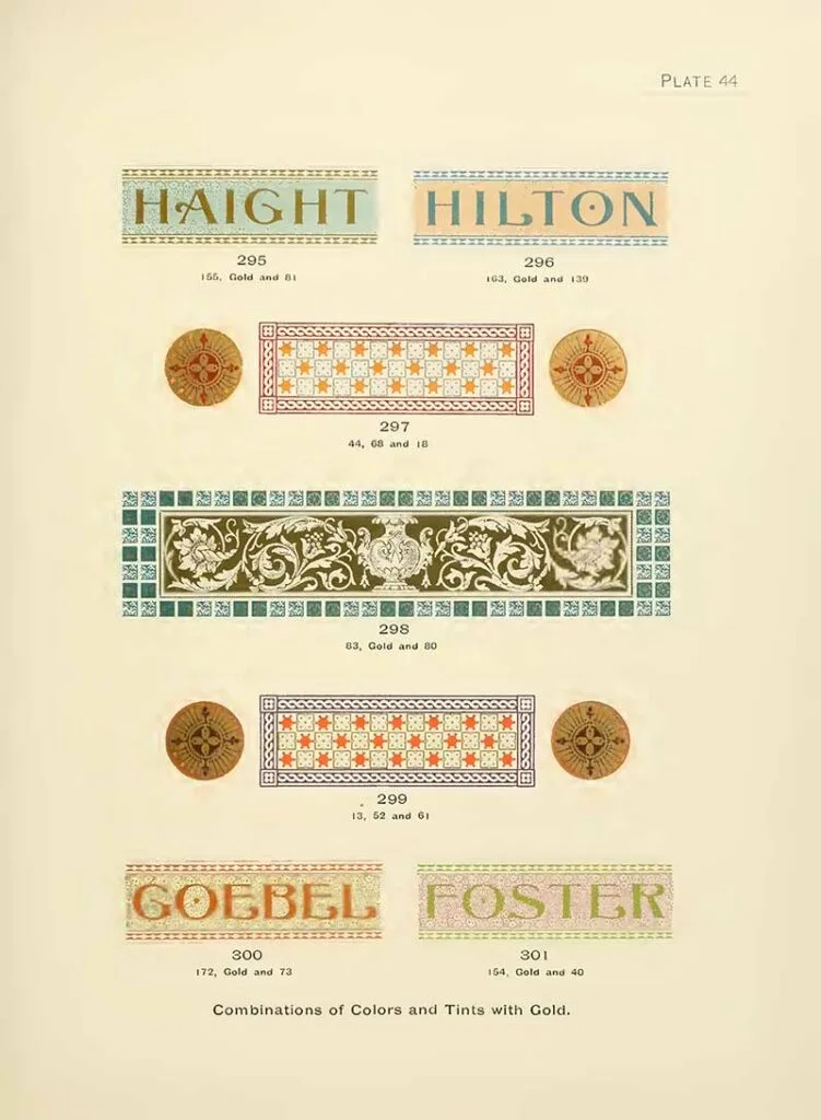
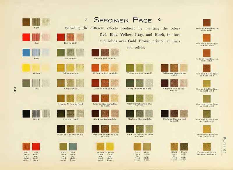
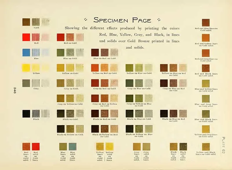
15. Combinations of Colors and Tints with Gold 1

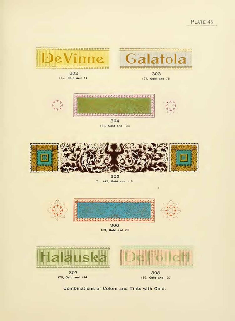
16. Combinations of Colors and Tints with Gold 2

17. Combinations of Colors and Tints with Gold 3
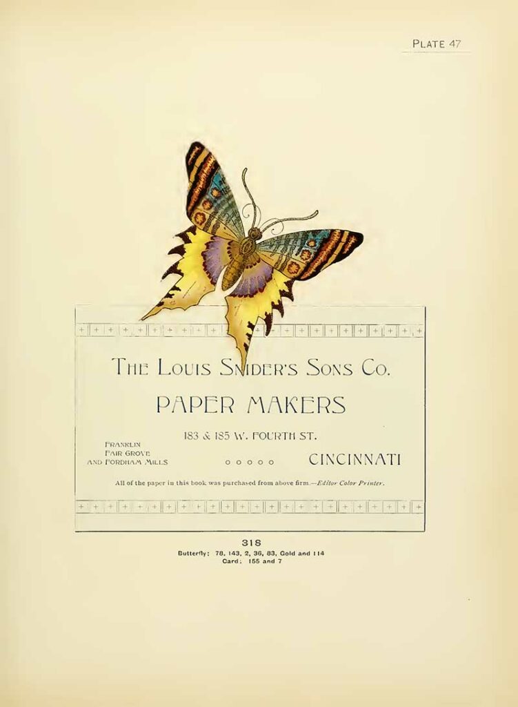
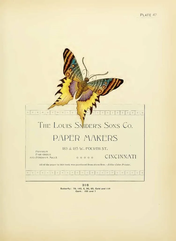
18. Combinations of Colors and Tints with Gold Butterfly
A print sample of gold tints illustrated with this beautiful butterfly. You can find more butterfly illustrations here.
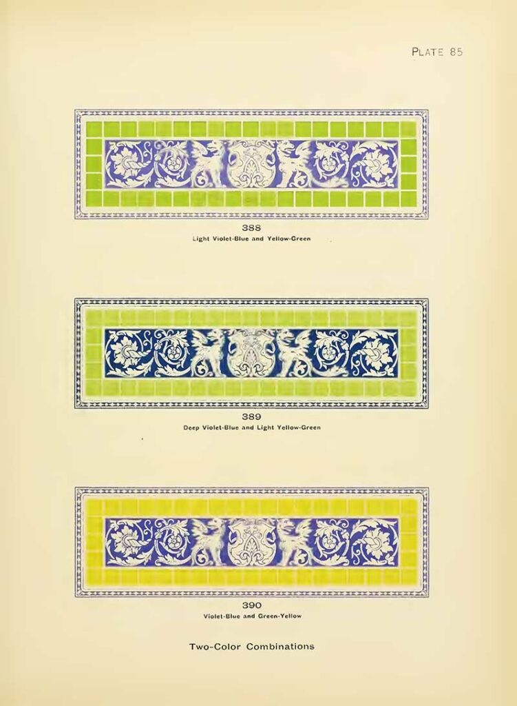
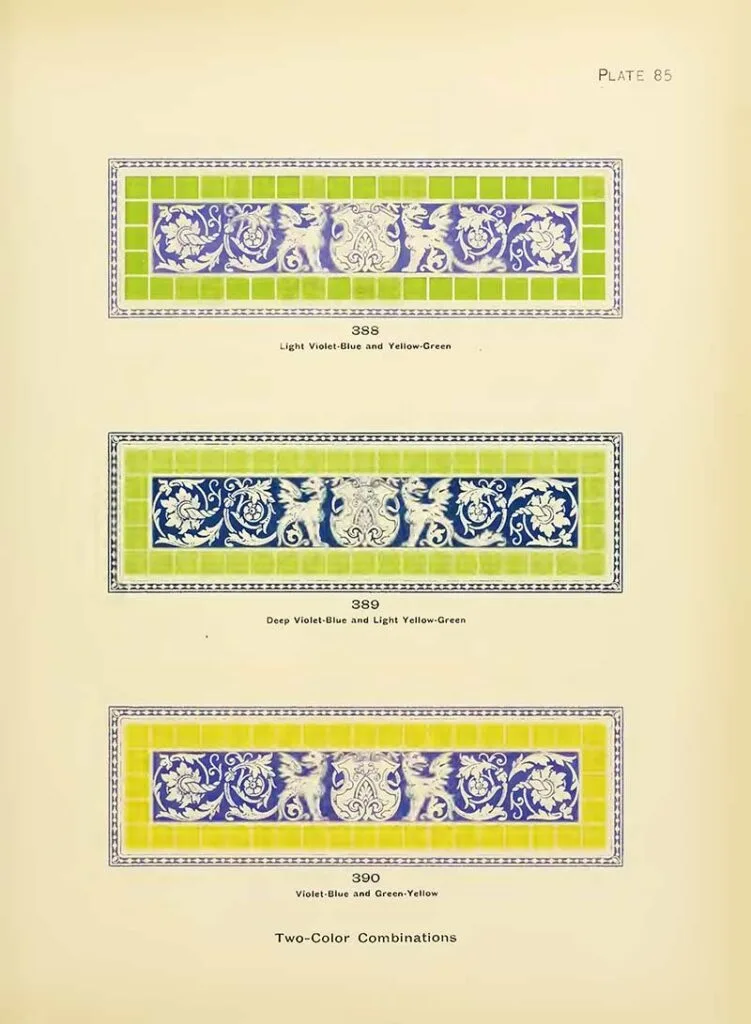
19. More Two Color Combination Patterns
“Plate 85, which shows a combination of deep violet-blue and light yellow-green, the former being a hue of blue, and the latter a hue of green. Fig. 388 shows a violet-blue and yellow-green about equal in tone, making a poor combination because the contrast of tone is very weak.“
Popular Theory of Colours
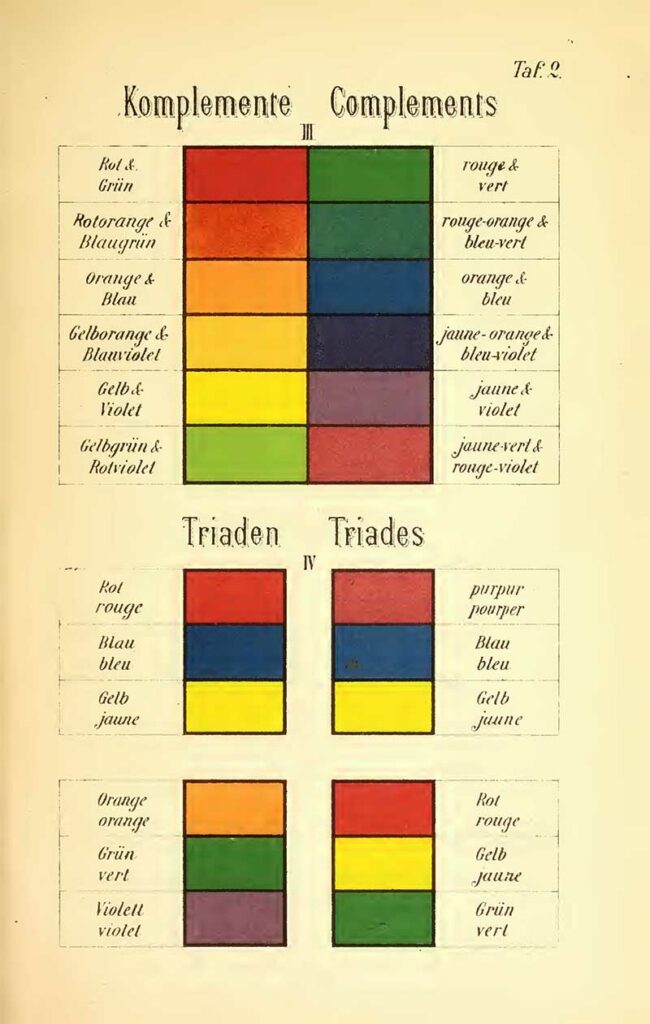
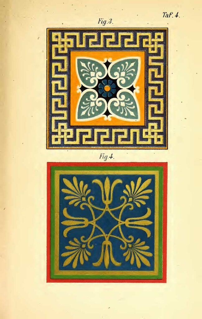
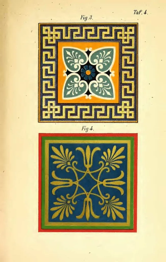
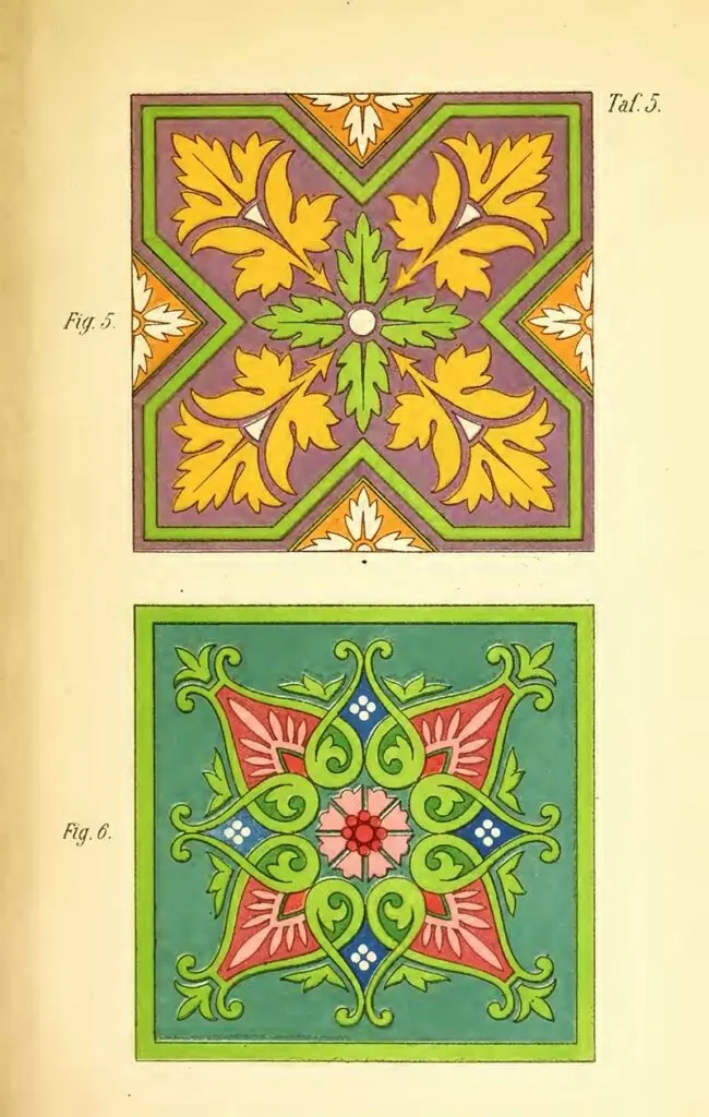
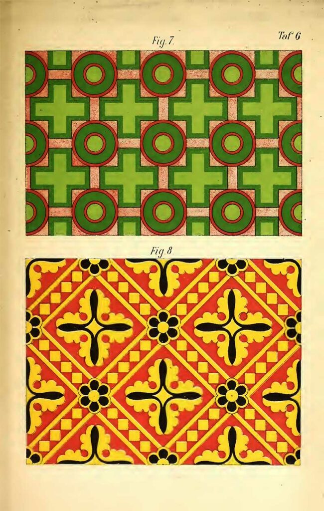
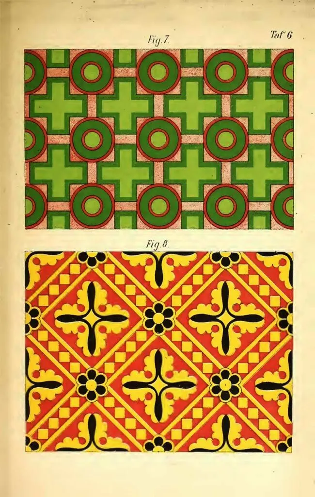
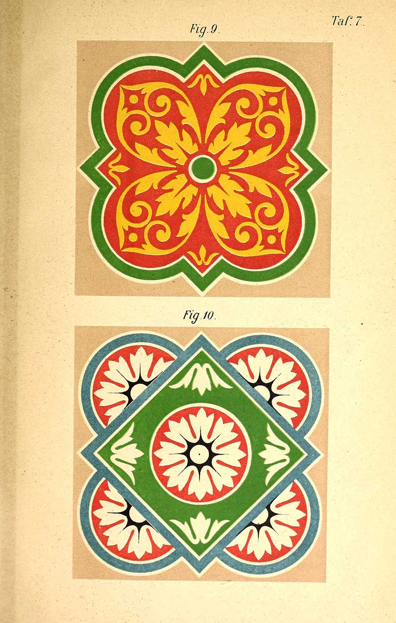
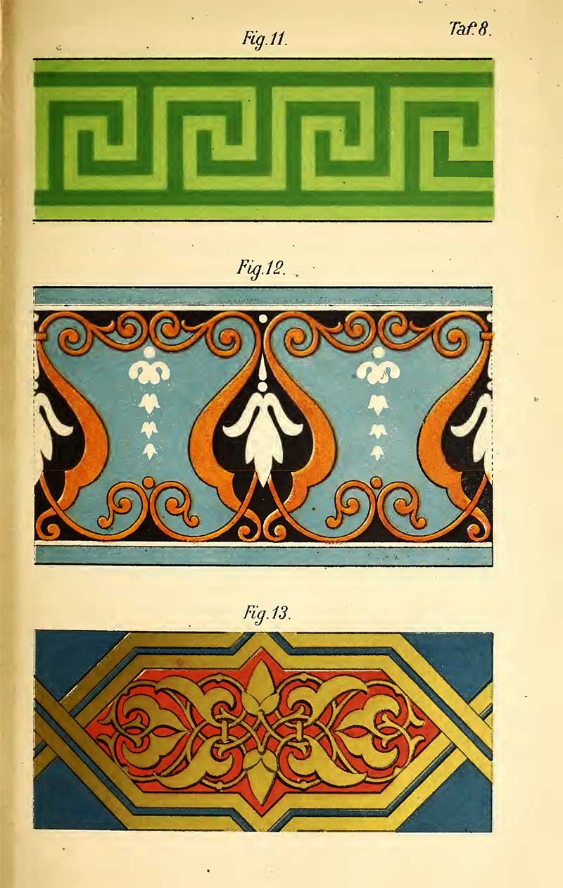
The following colour and pattern charts are from the German textbook “Popular Theory of Colors for Use in middle schools, high schools, seminars, advanced training, and trade schools as well as for Self-teaching for Artists and Laypeople” (1882) by Häuselmann J.
Two colour charts help explain the colour theory in the text, and five colour and pattern plates illustrate aspects of the theory.

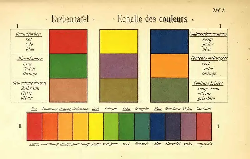
23. Complementary Colours Chart

24. Colour and Pattern Example 1
25. Colour and Pattern Example 2
Contrasting floral and leaf motif tiles.

26. Colour and Pattern Example 3
Geometric green crosses and red and green circles.
27. Color and Pattern Example 4

28. Color and Pattern Example 5

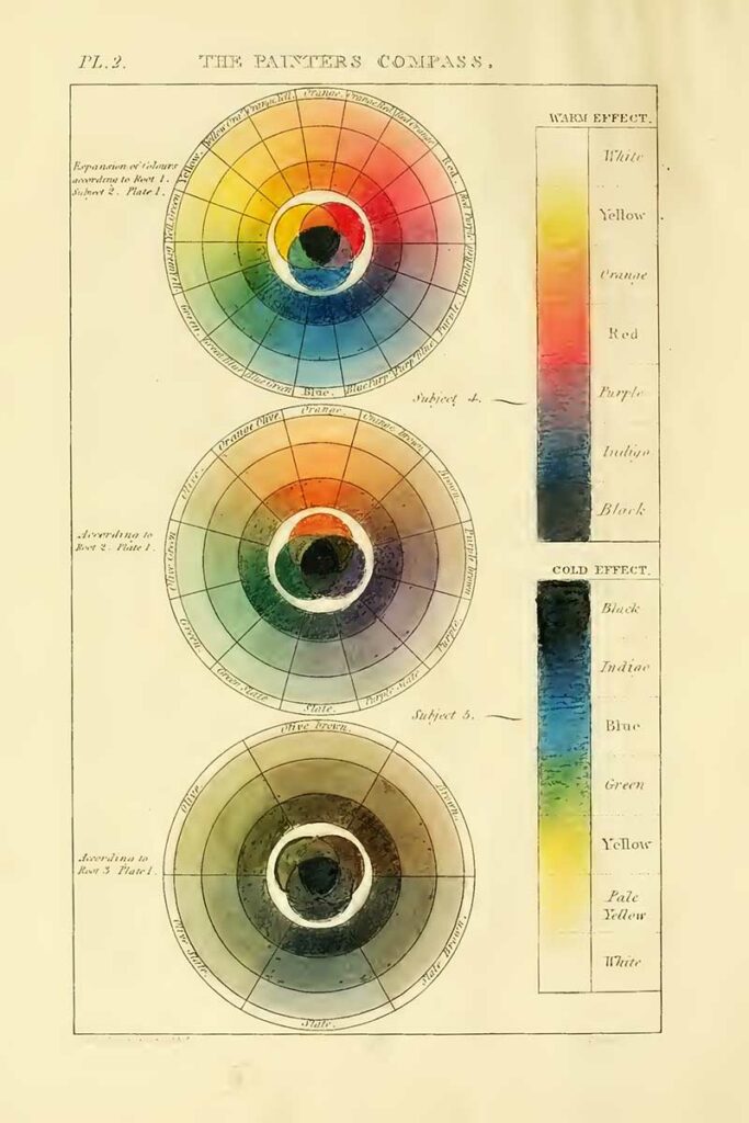
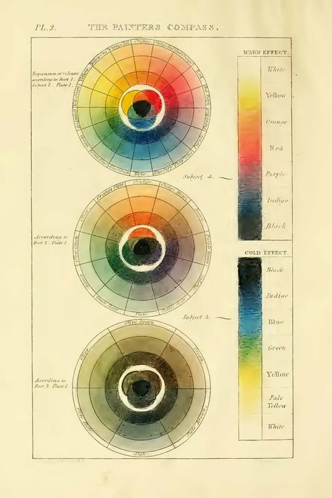
The following colour chart is from the book “A New Practical Treatise on the three primitive colours, assumed as a Perfect System of Rudimental Information… With Some Practical Rules for Reflections; and Sir Isaac Newton’s Distribution of the Colours in the Rainbow” (1826) by Hayter, Charles.
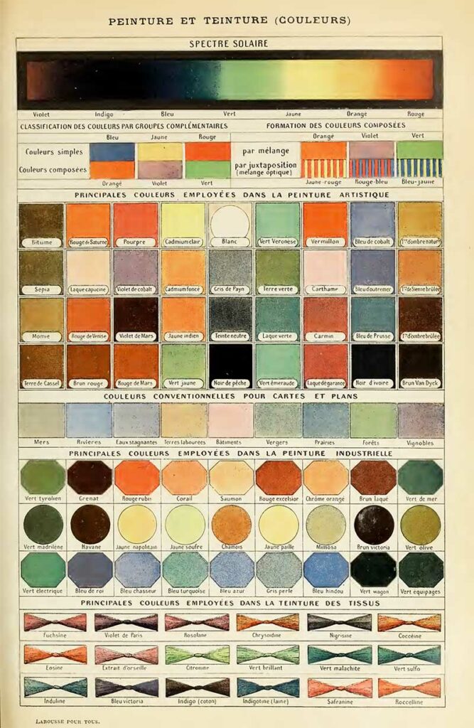
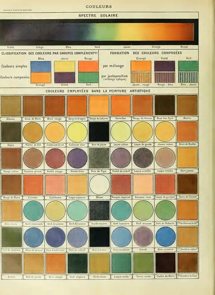
Larousse Pour Tous
The following three colour charts are from Larousse’s world-famous French Illustrated Encyclopedias. You can see many of the Natural History posters from Larousse here.


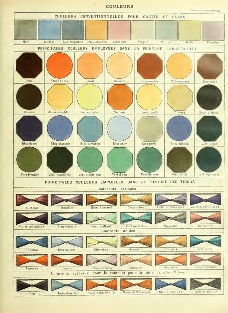
32. Chart of Conventional Colors for Maps and Plans

Other Pattern Charts
If you enjoyed these colour and pattern prints, you should check out many of Picture Box Blue’s art and design image collections. These include many collections of wonderful colourful patterns such as those of Owen Jones’s Grammar of Ornament and the Polychrome ornaments of Albert Racinet. Also, the art and decoration design prints of Christopher Dresser.
There are some stunning Art Nouveau patterns in the Koloman Moser collection and amazing folk art patterns here.
Also of interest to those who like vintage graphics is Strong’s Book of Design and amazing American Type Founders Catalogue.
There are many wonderful vintage Japanese patterns and designs here.
If you fancy, you can Buy Me A Coffee Here.
Weekly Rambles - Lora B. Create & Ponder
Friday 11th of June 2021
[…] thought these free printable vintage color and pattern charts were so […]
Pam
Wednesday 2nd of June 2021
This is all so interesting to me. I love learning about color. I'll be featuring this post at the Thursday Favorite Things party tomorrow. Congrats!
claire
Thursday 3rd of June 2021
Thank you so much, I look forward to seeing the feature.
Cecilia
Sunday 30th of May 2021
This is so intriguing! I love playing with different color combinations. Thanks for sharing at Vintage Charm!
claire
Monday 31st of May 2021
Thank you, it is fun to see what colours work well together.
Gwen McMartin
Sunday 30th of May 2021
These are beautiful! I work in collage/mix media . . .thanks so much!
claire
Monday 31st of May 2021
Thank you, it's good to hear you can make use of the images.